

January 29, 2021
 Kinga Edwards

Everyone's talking about landing pages: for replacing websites, boosting conversion, or generating leads and sales during a particular campaign.
Do we all know what it takes to build a really effective, functional, and successful landing page, though? What should your landing page design consist of, and what are some mistakes to avoid when creating your site? Where to get some landing page design inspiration?
Well, we've got you covered. We decided to identify a few principles and practices to follow for each landing page design. If you're interested in turning your touchdown page into the best landing page possible, you're in the right place!
Create pages using AI features to generate text, SEO and edit images to work more efficiently and publish high-quality pages.
The first step to building an effective landing page design is arranging its various elements. From a business point of view, the most important information should grab the reader's attention first, so put it at the top. All "above the fold" elements should be visible as soon as the page loads without scrolling.
The following list of the most vital elements will help you arrange them properly.
The "beyond the fold" area is accessible by scrolling the page down. While not all landing pages have this part, if included, those elements have a role to play too!

Even the best landing page design won't work if all the elements do not visually fit. A landing page should be neat and straight to the point, without unnecessary images or information. Also, make sure that color schemes are maintained in branding colors, since they may affect brand awareness and the connection between a particular campaign and your overall brand.
Tip: if no design ideas flash into your mind, dive into some landing page design examples and get inspired. Check, for instance, some of the best landing pages for:
The landing page does not have to be identical, but it does need to be coherent between all links. The same design in terms of colors, fonts, and image types makes the experience consistent.
If visitors cannot see the connection between your landing page design and brand then they might get confused, and ultimately they may leave your site to never look back.
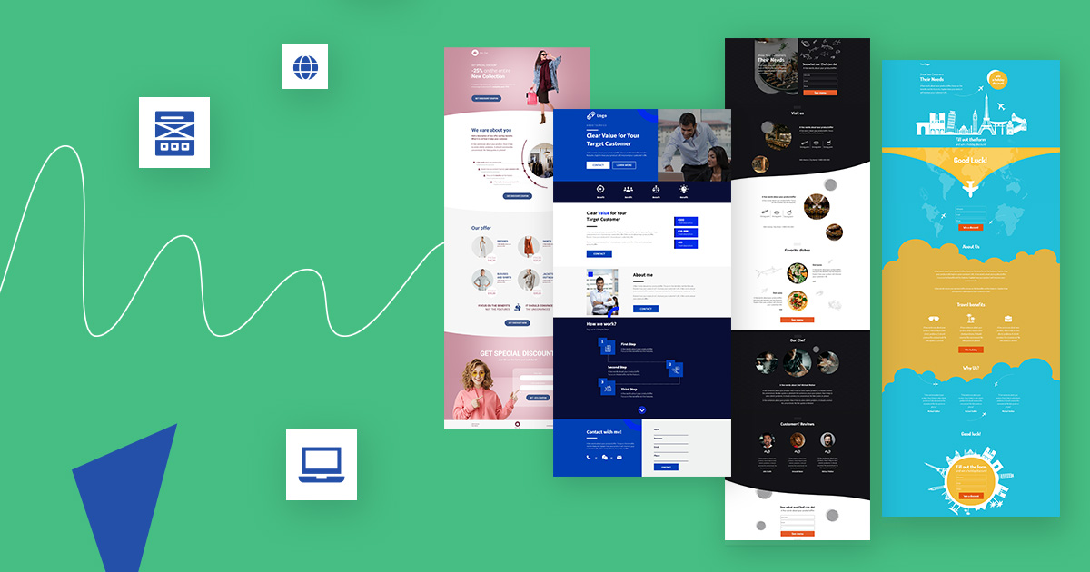
The first thing people see is the visuals, then the text. Therefore, consistency in landing page design is essential to encourage visitors to stay on the site. Get inspired and take a look at some landing page examples where the design is cohesive and matches the brand's visual identification. You can get more landing page design inspiration at Landingi. See some fully-customizable landing page templates designed with consistency as well as conversion focus in mind.

View the full sales-oriented squeeze-page template: "Vitamins & Dietary Supplements".

View the full company-presentation landing page template: "Lawyer Council".
With the tools that are available, maintaining a harmonious design isn't difficult. If you're looking for a tool to build a WordPress landing page that fits your client's web design, Landingi may be a great choice.
A landing page that is packed with too much information will overwhelm the reader. That's why it's vital to find a solution that reduces the number of essential details to a minimum. It needs to be brief, concise, and to the point.
Use short paragraphs with headings and subheadings. Such breaks in the text allow readers to quickly scan the entire text and focus on what interests them most.
Try to personalize your message so that the recipient perceives it more individually. The key is content with a strong narrative that appeals to the audience's emotions and personal circumstances. People want to hear how the product or service might influence their lives or work.
Focus on the benefits that your product or service can bring them rather than the features. This is actually what we call a value proposition (find out more).
Making the content more engaging and more comfortable to read can positively impact the conversion rate. Use language that indicates that access to the product or service may be limited, i.e., use the FOMO approach. This will make visitors more motivated to take action and to do so faster in order not to miss a unique opportunity.
You can also take advantage of the growing popularity of video content, which can significantly enhance customer experience. 96% of people watch videos to learn more about products or services.
No other content may engage the viewer as much as an interesting short video that illustrates a product or service's values. Plus, you can communicate more information within a short period of time. The landing page design inspiration below shows how you can include a video on the layout:

You can either create an animated explainer video that explains the most crucial features in a minute or so, record a short trailer, or film an invite. Remember not to overdo it since a landing page is not a good place for long-winded videos.
An absolutely vital element that must appear on each and every landing page is a call to action button. A landing page is meant to convert traffic, so how can you make your CTA button scream out for attention?
Human nature compels us to pay attention to anything that is highlighted, distinguished, or with contrasting colors. Remember that when you place the CTA element on your landing page design, the button must stand out from the background in order for it to be noticed within seconds. Let's take a look at two examples:

Senuto banks on a centered green button, clearly distinct from the blackness around.

Ikea highlights its CTA with bright yellow and grand size. Note that there are also no distractors in the neighborhood.
Use white space around the button to draw visitors' attention and navigate them straight to the CTA.
White space (also known as negative space) is all the unmarked space on the layout. Look at landing page design inspiration where a large space is kept between the copy and the button so that the latter is in the spotlight. It's a highway to increasing conversion rates.

Landingi "Online Food Ordering" template.
You can't just pick one color that works for every product, service, and page. Even if you read a study that says green colors work better than red, it doesn't mean that your audience will react the same. Instead, your own testing should give you an answer.
The same applies to the button copy. Adjust the language to your audience and match actions with visitors' expectations: the goal is to provoke a quick reaction. Even a small change in the text can have a huge impact on the conversion rate.
Tell your audience what the benefits are, not what the action is. Instead of a button saying “download”, it may be better to replace it with “get my copy” or “get it for free”. By testing this you can attract more attention, and people who click through will know precisely what they are getting in return.
The CTA button should be large enough to stand out but not so large that it distracts from the rest of the landing page design elements.
Larger button = more attention
To sum up, when choosing the appearance of the CTA button, it's extremely important to match it to your brand and your audience, but also to the results of your ongoing tests.
Get 111
Landing Page
Examples – the
Ultimate Guide
for FREE![]()
When developing a website, you need to keep in mind that the landing page may be viewed on different devices. Due to this, the site must be responsive and easily adaptable. In 2021, it's no longer a choice but a must, which a lack of can cost you dearly.
In 2020, about 54% of all website traffic worldwide was generated through mobile phones. This trend will continue to grow, challenging you in terms of RWD.
The best way to be sure that everything works well is responsive design, which guarantees that the browsing experience will be the same on all devices. All links, button sizes, and images will be adjustable, and their appearance will depend on the screen size.
How many times have you given up browsing a website on your phone because it didn't work well?
Unfortunately, although mobile devices are responsible for most Internet traffic, this still happens. When creating a landing page, keep in mind that visitors won't wait for it to load correctly or for a button to work.
Your chosen landing page builder should support the intuitive creation of responsive web design. It would be perfect to have the option to edit the mobile view separately, as it allows you to optimize it exactly for mobile users. This is what you have in Landingi editor, where the mobile view of the landing page is built automatically based on the desktop view, but you can also change it independently anytime you need (learn more). See below the "E-sport Betting" template by Landingi in two preset versions: desktop and mobile. They are perfectly cohesive, though the dislocation of elements may be a bit different.
Desktop view:


Mobile view:


When users can easily explore your website or landing pages, they may spend more time on a site and be more likely to take the expected action.
A responsive landing page design gives much more than useful content. Use all its potential. If you're not convinced yet and simply need more data to back it up, check out Why Responsive Web Design is So Important Right Now
The main assumption is that a landing page needs to be simple and focused only on what matters to drive the visitor straight to the point. This applies to navigation, so distractions must be eliminated. Reduce the number of subpages (if they are needed at all) or lock them all in the form of a “hamburger” menu to steer the navigation.

If a landing page is easy to navigate for visitors, it's more than probable that it is also easier for them to convert (example: LeadsBridge).
Do you REALLY need all these fields on your form? Did you know that reducing even one, single field may boost your conversion by quite a few percent?
We have already mentioned responsive web design. This applies a lot to contact forms. Just imagine that someone lands on your page on a mobile device. Take care to make the whole process that leads to a goal as easy as possible. Think about which information about the lead you really need. People are more likely to fill in a form if doing so will not take much time.
You can use our contact form templates in the landing page creator. They are secured by anti-spam protection, which means your form won't collect empty leads.
While we're on the subject of forms, you should notify visitors that you have received the information once it has been submitted. This could be just a small in-line message, or a thank you page. It's a great way to move your lead down the marketing funnel. Below is an example of a "thank you" page that encourages visitors to convert further:

If distractions must be kept to a minimum, should I also remove social media buttons?
Opinions are divided. Some say that it is an unnecessary distraction from the desired action. Others that visitors can use these buttons to spread the word about your products. And they're both right.
Even on a site with the best landing page design possible, there is a risk that a visitor will click on the social button, become preoccupied, and forget to return or leave their information. If you have objections to putting them on the landing page, think about placing social media buttons on the "thank you" page instead. This will ensure that a visitor will only go to explore your social media profiles after performing the desired action.
Tip! If you decide to add social icons to your landing page, be sure that the link opens in a new window or tab else you may lose your lead forever.
Let's move on to optimization. Your landing page needs to be optimized with the right keywords to increase your chances of gaining organic traffic. If the landing page isn't optimized, it won't be able to generate leads. But don't overdo it: write to your visitors, not to SEO. Using the right keywords in the right places will make your landing page more visible.
Think about the best words to describe the page, make a list, and do some research by seeing what pops up when you do a Google search.
In this case, the page loading speed is also an essential factor, since it can boost your landing page's position in search engine results pages. Monitor the page load time and improve it if it takes too long.
A fast page means a lower bounce rate, and that could have a significant impact on rankings.
Once you have created the landing page you have to go move on to the next stage, which is testing. This step is critical because it gives you an overview of what works and if it works well. To ensure the best landing page design, test it from A to Z. Click on the CTA, try filling out the contact form, see if social buttons are well-linked, and make sure any extra assets work correctly (if you have them).
And then do it once again.
You can perform an A/B test, which is a way to identify the most effective version of your landing page design. The key is to test frequently and thoroughly. You will gain an understanding of what influences visitors' behavior and what does not. One of the most important steps in testing is an analysis. If you do not analyze the results, you will not be able to draw the right conclusions.

Thanks to A/B tests you can reduce bounce rate, which in turn leads to a higher conversion rate. They also decrease the risk that the landing page will be ineffective, thus avoiding costly changes later.
This is just a glimpse of what testing can give. If you want to find out more about A/B tests and how to implement them, you should read our blog post: A/B Testing Step by Step
Finally, don't be averse to using analytical tools. With them, you can collect data that will allow you to better understand the needs and pain points of your users. Eliminating the latter results in increasing conversion rates.
Properly configured analytics will also help you identify elements on your landing page that may be annoying and prevent them from converting.
You can gather basic information using Google Analytics. By knowing the bounce and exit rate of the page, you'll be able to assess its overall performance.
Check out here how to integrate your landing pages created in Landingi with Google Analytics 4. You can also track A/B tests in your Analytics account (learn more).
However, tools that allow tracking of micro-conversions, like video views, button clicks, and even the user's scroll location, are worth their weight in gold. This way, you can easily identify elements of the landing page design that require immediate improvements. It may be a broken video, invisible CTA, or mismatched color selection for some sections. This is why Landingi is coming up with EventTracker, a powerful tool for tracking micro-conversions on landing pages. Subscribe and be notified once the tool is released. It's a matter of weeks at the latest!
After learning all there is to know about designing landing pages, it's time to select a tool that lets you create a responsive, visually coherent, and effective landing page design. Make it easier for yourself with a free trial of Landingi, a user-friendly landing page builder.
Using it makes the whole process much more enjoyable and faster. You can choose from a wide range of fully-customizable and conversion-driven landing page templates or make your own. You may either generate and personalize copy with Landingi's AI generator to save time and reach precisely the target audience. Creating landing pages has never been so easy before!
Not to mention that in Landingi, you also have at your fingertips a multitude of additional design elements to enhance your landing pages with: videos, images, sliders, lightboxes, unfolding sections, counters, and much more.
Learn here how to improve landing page design with additional visuals.
Try to apply all the principles we have talked about in this article, make the best landing page design possible, and meet your client's expectations. Fingers crossed!
Ready to grow? Let’s get started! Join us and create the best-converting landing pages

Related articles

